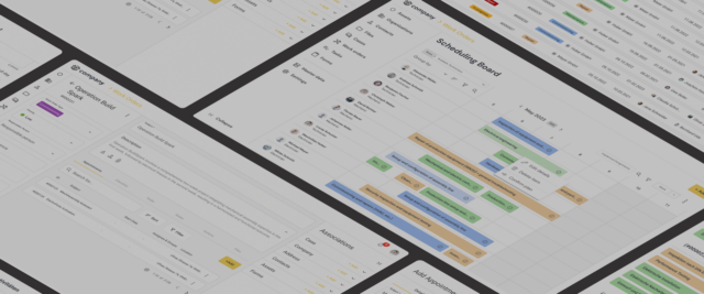
Discovery and iterative redesign for a complex scheduling board feature
Product discovery
Usability testing
UX design
Overview
Working on a complex scheduling feature for a B2B SaaS start-up, I conducted a large redesign project for which we went through the entire user-centered design process. We conducted a qualitative user research project for discovery before starting with ideation sessions and then moving on to the design validation phase with four iterations.
My role
UX Researcher & Designer
Tools & deliverables
Product Discovery
Wireframing & Prototyping
Design Workshops
Agile UX Testing
Background & challenges
Working at a B2B SaaS start-up that was building a system for sophisticated asset management in the machinery industry, one of the solution’s key features needed a major rework. Me, a Product Manager and a Product Designer teamed up to conduct this redesign the user flows for the work order planning process and the scheduling board feature.
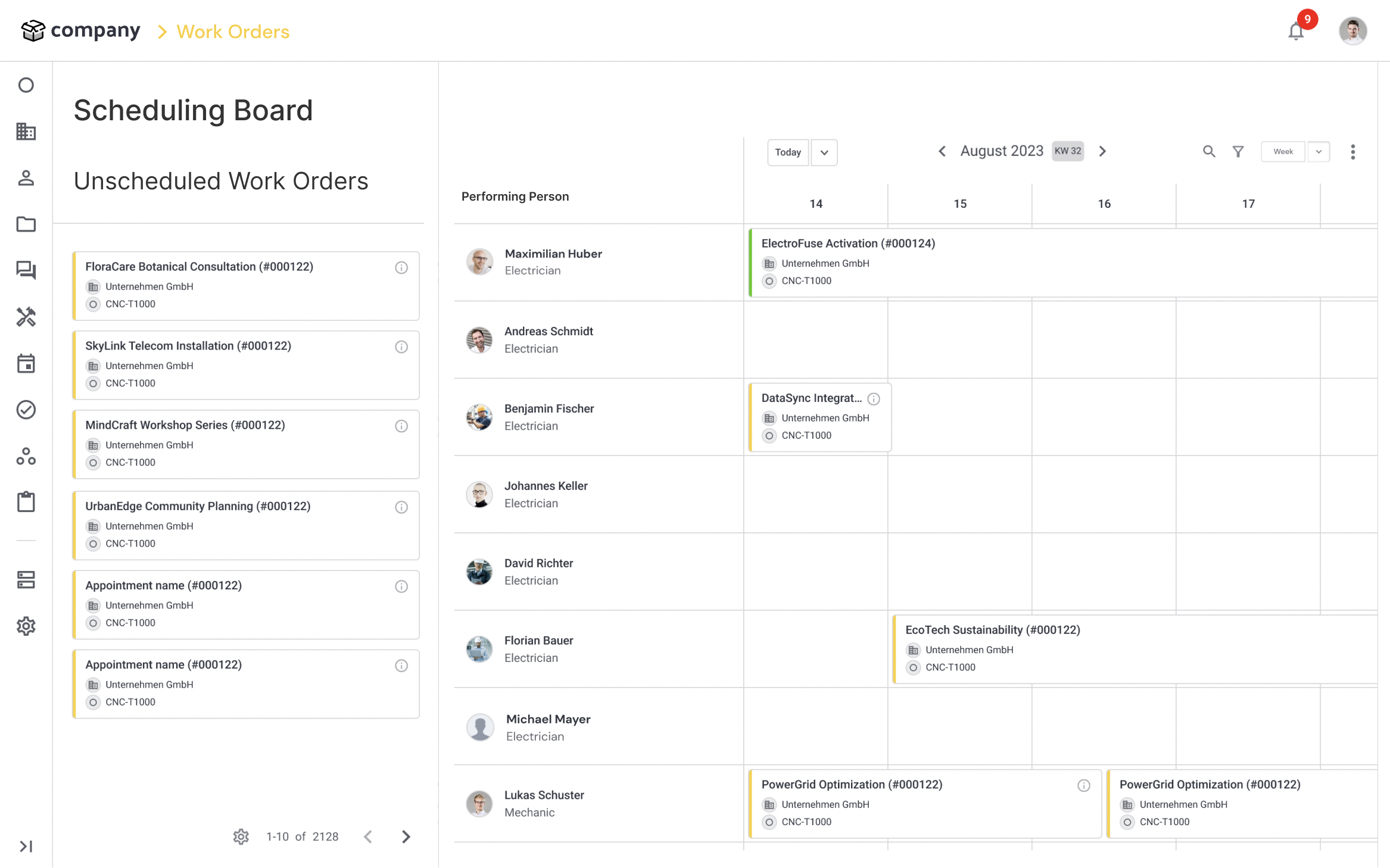
Both the Sales and Customer Success teams assumed that an improved version of the scheduling board feature would entail significant business value through increased annual recurring revenue and improved customer retention.
Project objectives
We aimed to drastically improve the user experience for field service and commissioning planning by extending the board’s functionality and improving its usability. The initiative’s key goals were…
- …to explore the problem space and build a profound understanding of customers’ processes, pain points, and needs.
- …to clearly define and (re)scope the current project and outline a roadmap for future improvements.
- …to add substantial user value by redesigning the work order planning functionalities.
- …to de-risk the new version before implementation through iterative user testing.
Existing user needs and pain points
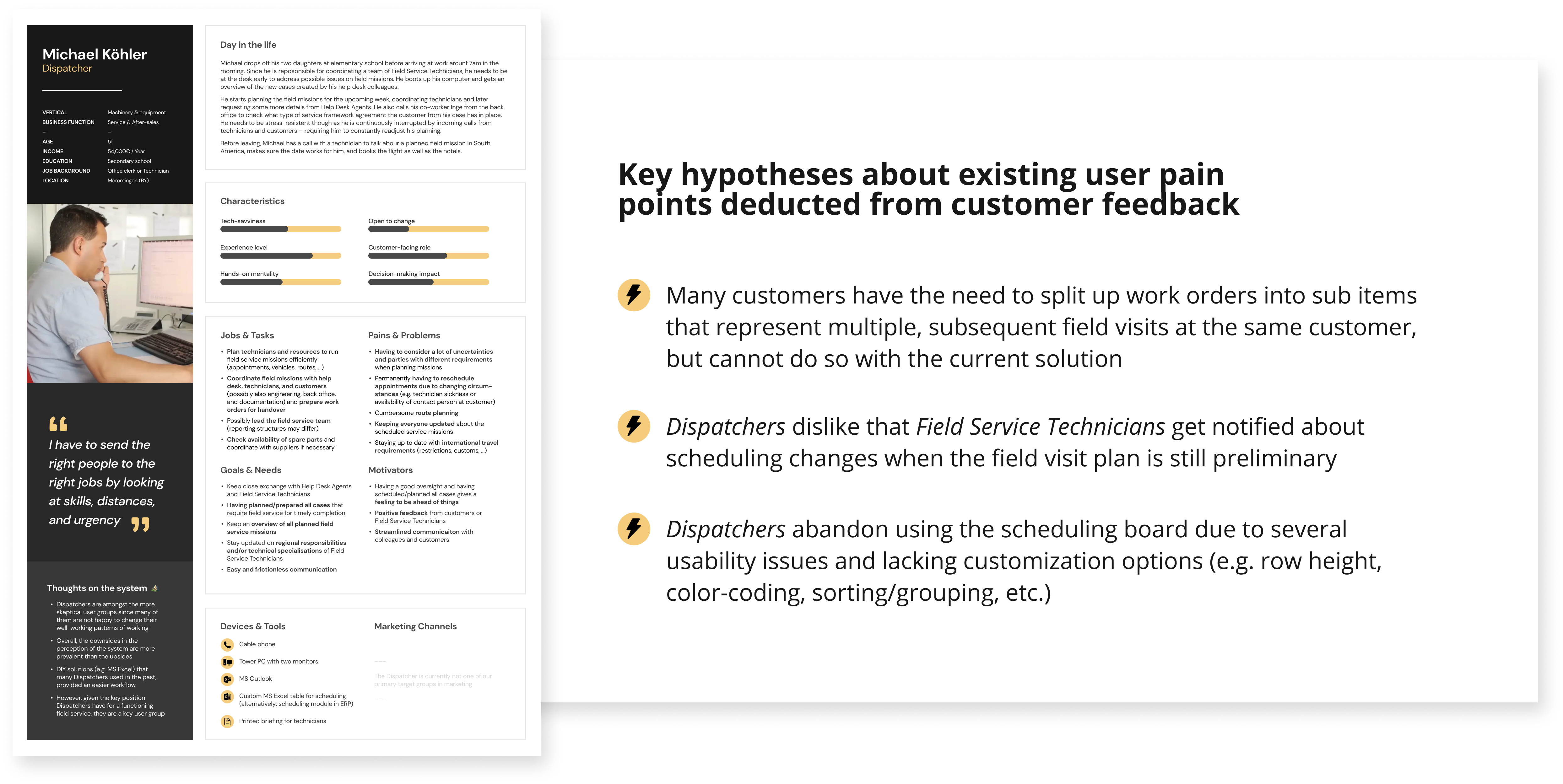
Since this was an existing feature, we already had an idea of who the users were and what issues they experienced with the product. In an earlier project, we had built a thorough understanding of the involved roles and created detailed user personas. For this project, the primary user persona was the Dispatcher and secondary ones were the Field Service Technician and the Head of Service.
In addition, we clustered and summarized customer feedback and already recorded user problems that were related to teh work order planning process.
The process
We followed our product design framework and started the process with an exploratory user research project in order to thoroughly understand and define the problem space of our initiative. Having discovered and prioritized several themes and user problems associated with our opportunity, we moved on to the ideation and iterative design validation phases.
Problem space discovery
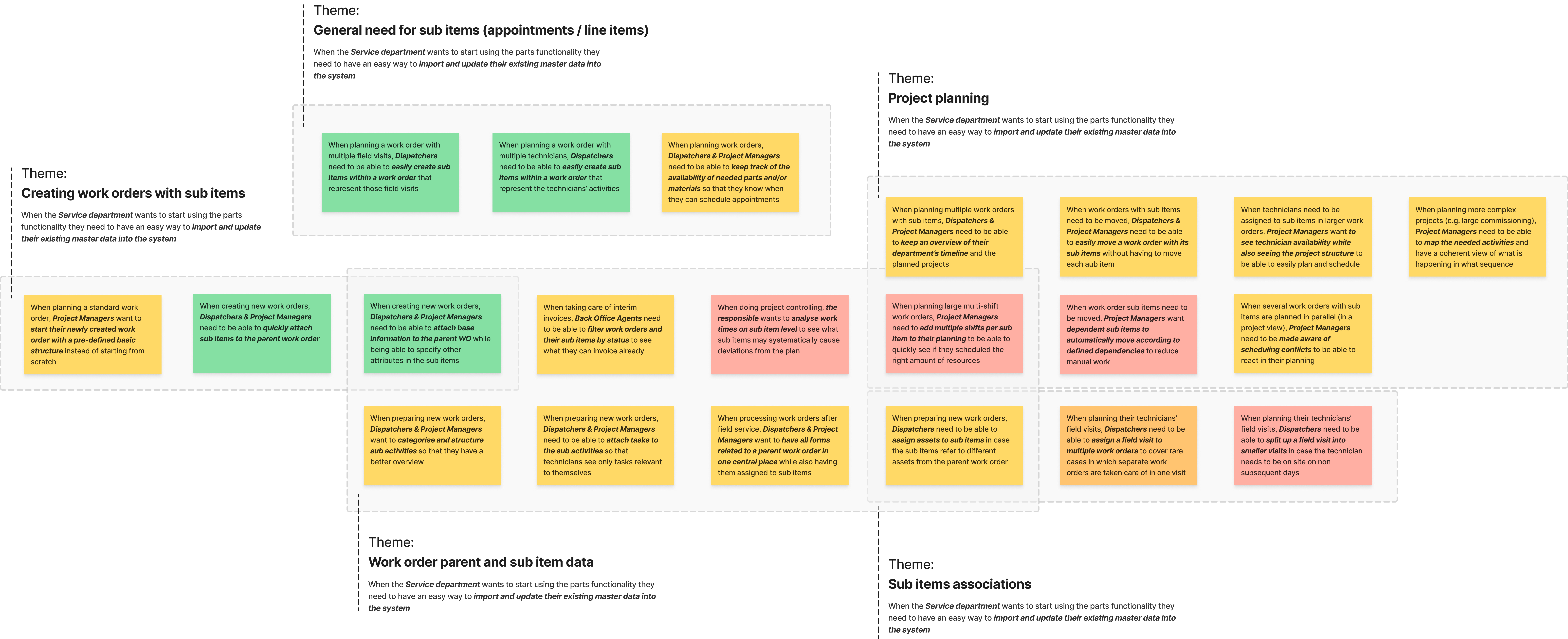
In order to further validate the opportunity and explore its underlying themes, we conducted N=10 customer interviews with our target personas (Dispatcher, Head of Service). To properly set up the discovery, we started with secondary research (competitor analysis, internal interviews, and a deep dive into recorded customer feedback) before talking to actual customers.
Having conducted the interviews, we synthesized the collected data and deducted 21 problem statements.
Ideation & prioritization
In order to kick-start the creative process and generate a wide range of ideas for possible solutions, the core team conducted an ideation session in which we brainstormed how we could address the uncovered user issues. The workshop was framed in a way that constrained the ideation activities to relevant user problems. After generating the solution ideas, we prioritized them based on viability and feasibility constraints and decided to focus on introducing the new assignments object, a mode that enables users to do preliminary planning, and several smaller usability improvements.
Flow charts & wireframing
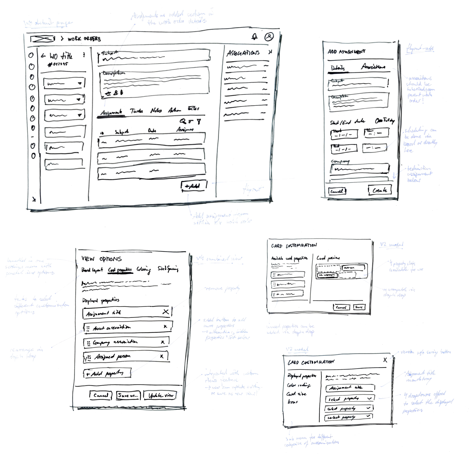
Having made the decision which opportunities and solution ideas we want to explore further, we started designing the improvements by making first paper sketches and creating task flow diagrams to get a good overview of the overall user flow. Since our new solution evolved around a newly added item – assignments – we also created an updated object model to clarify how it would fit into the existing object relations.
We iteratively added more fidelity to the new concepts and created digital wireframes for several updated pages and sections, incl. the work order detail page, the assignment details, the scheduling board, and the unplanned assignments.
Iterative design validation
Starting with exploratory testing of early design concepts, we evaluated multiple, very low-fidelity solution ideas in our first iteration of concept user testing. After being able to narrow down in what direction we are going with our solutions, we gradually moved to more summative forms of user testing – focussing on the new design’s usability and clarity.
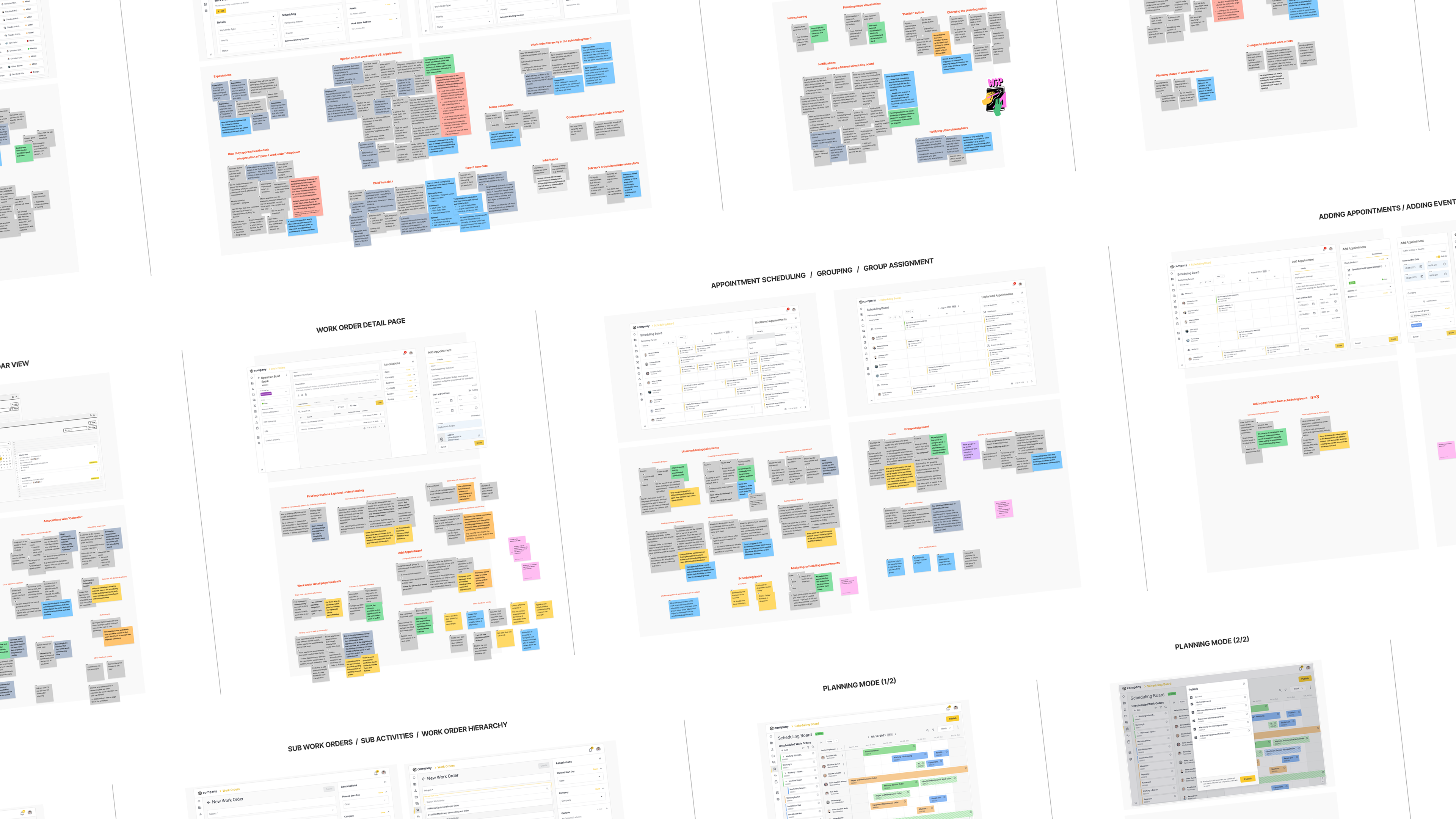
For each round of testing, we aligned on the usage scenarios we needed to test, created the prototypes using Figma, and prepared a session guide for the interviews. I conducted five remote interviews with our target group (Dispatcher / Head of Service) per iteration. After each round of testing, the core team joined for a findings workshop that I facilitated to collectively discuss implications for our solutions. In these workshops, I provided a walkthrough through the most relevant collected insights and the team color-coded the already summarized items to indicate the severity of the observed usability issues before discussing necessary changes to the designs.
Results & deliverables
Assignments
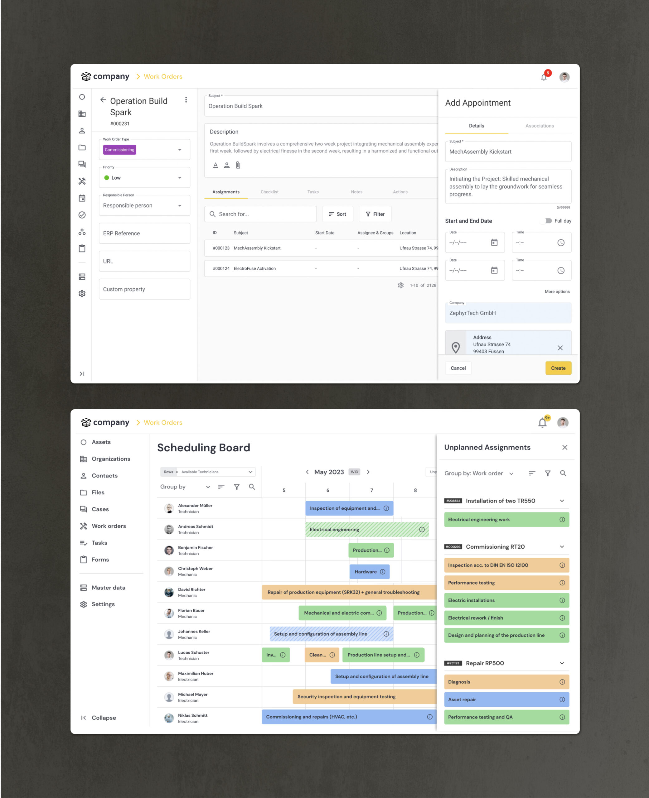
A new work order sub object was introduced with the new design. Each work order can now have several assignments that represent distinct field visits or activities conducted by different Field Service Technicians.
Assignments can be added from within a work order (inheriting its object associations) or directly from the scheduling board. In both cases, the creation is handled in sidebar flyout.
Planning mode
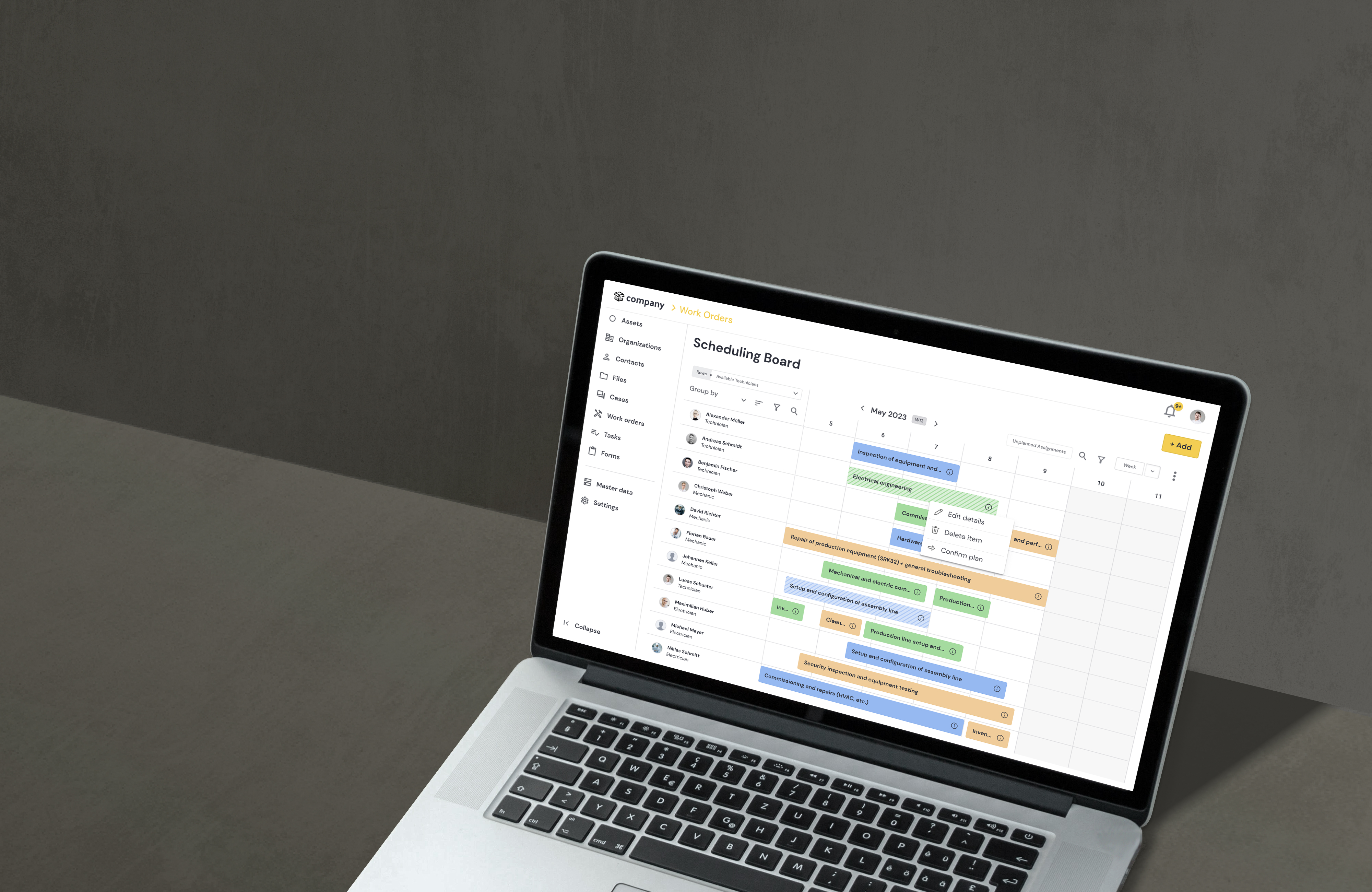
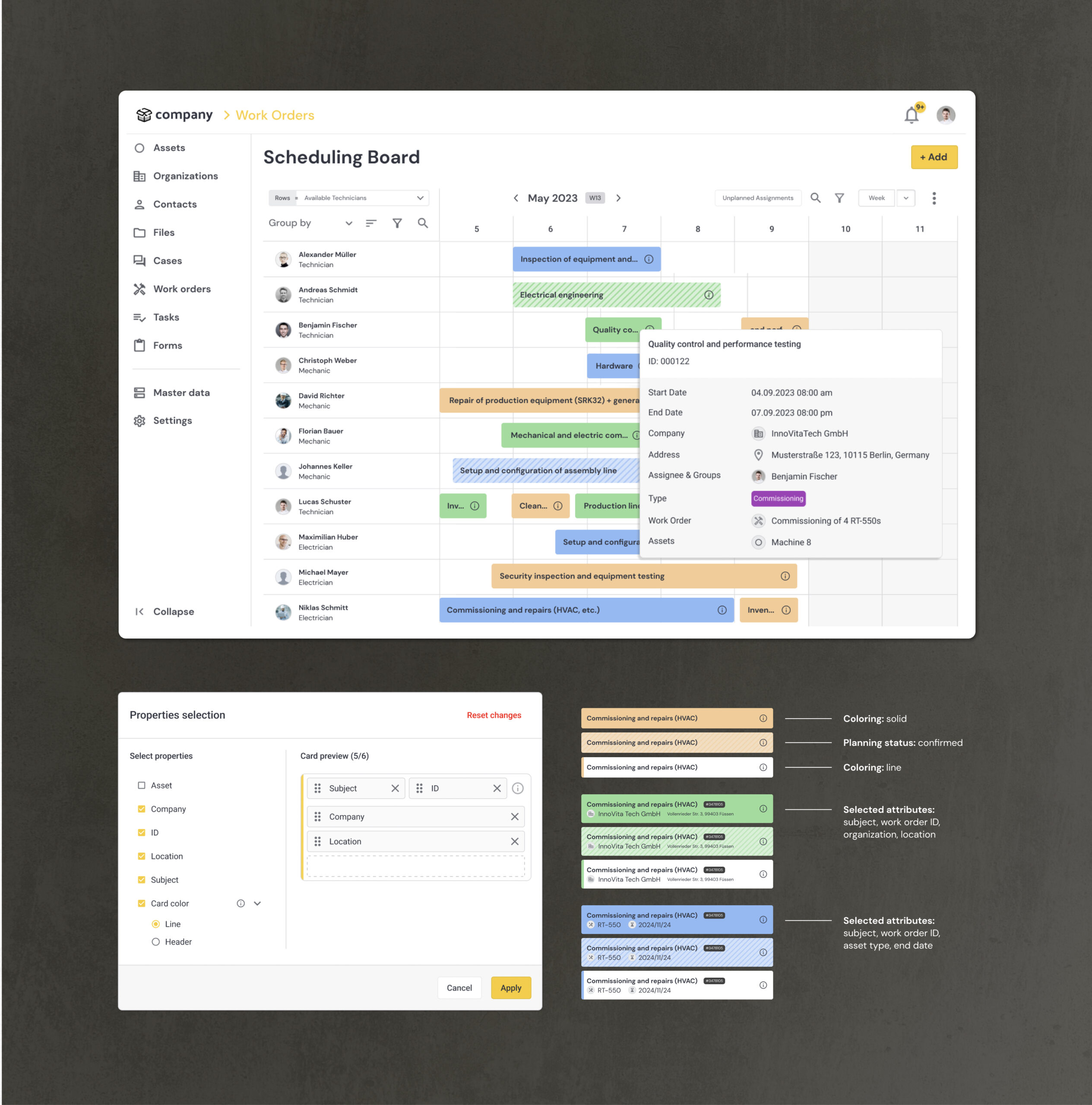
We introduced a planning status property for assignments to enable Dispatchers to do preliminary planning without sending notifications to the Field Service Technicians.
Preliminary assignments are visualized with a cross-hatched background. The status can be changed via context menu or through navigating into the assignment and changing the property there. Technicians are notified only after the Dispatcher confirms the planned assignment.
Usability and customization improvements
In addition to adding two important pieces of functionality to the work order planning process, we also addressed a series of existing usability issues in our project.
According to recorded customer feedback and the analysis from our product discovery phase, users had the need to customize the board to their own needs and were not able to do so with the old solution. We tackled this issue by adding an customization options dialogue that can now be accessed via the scheduling board’s overflow menu. The new options allow you to select the properties shown in the cards, the coloring (outline/solid), as well as the logic behind the color coding (color by: work order type, current status, etc.).
The property selection also addressed the existing issue of users not seeing enough technicians in their viewport as rows can now be configured to be considerably narrower. On top, we added an improved mouse-over tool tip and reworked the filtering and grouping options for the board.
Takeaways
Although we made some substantial improvements on the scheduling features‘ usability and usefulness, there still is more room for improvement. E.g. the problem space discovery led us to believe that for other use cases like commissioning planning, there is a big need for a coherent project view on the scheduling board. To address this need, another major rework of the board would be necessary. Also, the latest usability testings still revealed some issues around the clarity in regards to filtering and grouping options on the board.
To improve our product design process, the core team conducted a retrospective meeting in which we decided to make the analysis process for the product discovery part a bit leaner (especially the structured deduction of problem statements needed a lot of time) and to formalize the ideation process more by setting up a full-day workshop for the next project.
