Creating the corporate design and company website of uintent
Corporate design
Front-end development
UX design
Overview
In 2018 I co-founded uintent, an employee-owned UX research agency. As creative lead, I developed our corporate identity, incl. logo, colour scheme, typography, and imagery. For the creation of our company website, I moderated design sprints, created the information architecture and wireframes, and took care of a large part of front-end development.
My role
UX designer & creative lead
Tools & deliverables
Corporate design
UX design
Co-creation
Front-end development
Background & challenges
In 2018, I co-founded uintent together with 10 of my former co-workers from GfK. We were a group of UX researchers who came from a corporate environment where a lot of our energy went into managing internal relations and adhering to defined processes. We wanted to create an agency that’s truly human-centric and starts with its own employees.
uintent’s philosophy
We founded uintent with a set of common ideas in mind. uintent was meant to…
- …be an agile and less bureaucratic company where taking risks was supported.
- …give every employee an intrinsic motivation by making them shareholders.
- …have empowered co-workers that share all responsibilities instead of hierarchies.
We quickly decided that I would be responsible for creating the corporate design that would reflect those ideas. I had shown design expertise and a great sense for aesthetics in past projects. On top of that, I had some experience in front-end development and it was clear that the creation of our website would be one major task on our list.
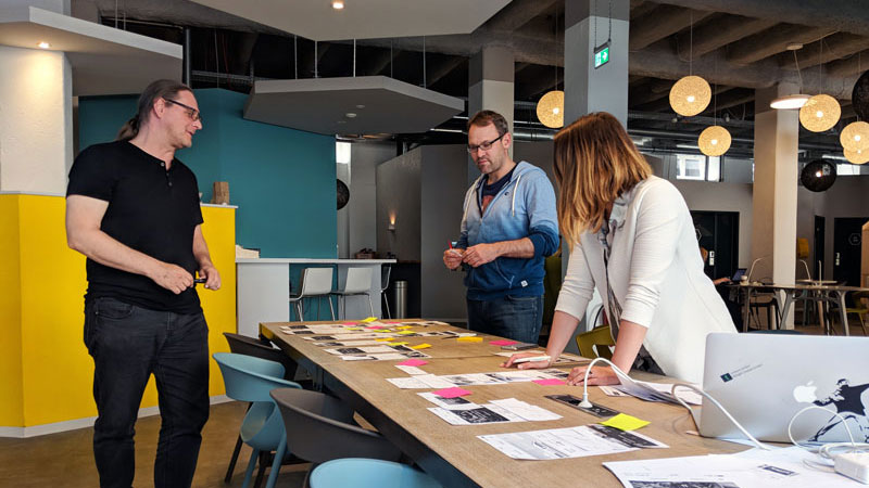
Although I was chosen as a creative lead, I was happy to get support from a team of people that complemented each other very well. We had another UX designer, a colleague responsible for content and copywriting and a super tech-savvy IT expert on our core team. However, I am pretty sure that all of my ten co-workers contributed since I did my best to keep the process open and co-creative.
What kept it very challenging was the fact that we had to build our corporate design while also doing regular project work. After our official foundation, the company hit the ground running and we had to juggle with a lot of project related and entrepreneurial tasks.
The process
At one of our quarterly off-sites, I moderated a short workshop with the whole team in which we collected and clustered terms and adjectives to describe our company. I used the results as mood board to guide further brand development. Later on, it also became the basis for our company manifesto in which we describe our philosophy and brand values.
The building blocks of uintent’s corporate design
After we defined our core values as a company and a last minute name change (we planned to be bold intent but had to come up with a new name only a day before our notary appointment due to legal reasons), we started with the key building blocks of our corporate design – our logo and colour scheme.
We collected a bunch of logo ideas from the group and discussed the drafts as well as people’s associations with them. We narrowed down at least 50 drafts to a reasonable amount in order to set up a vote. I refined and iterated my draft a few more times after it won the vote (it was the first corporate logo I developed and I had to realize that it’s extremely difficult). The logo we ended up with consists of a square with two rotated morse code characters – U and X. We continued to decide on a colour scheme in a similar process.
Since we were already writing proposals and reports, we had to move quickly to define the rest of our core design language. We chose Open Sans as a primary typeface and deliberately decided to not use a secondary typeface to keep things simple.
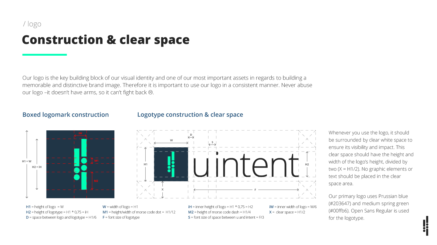
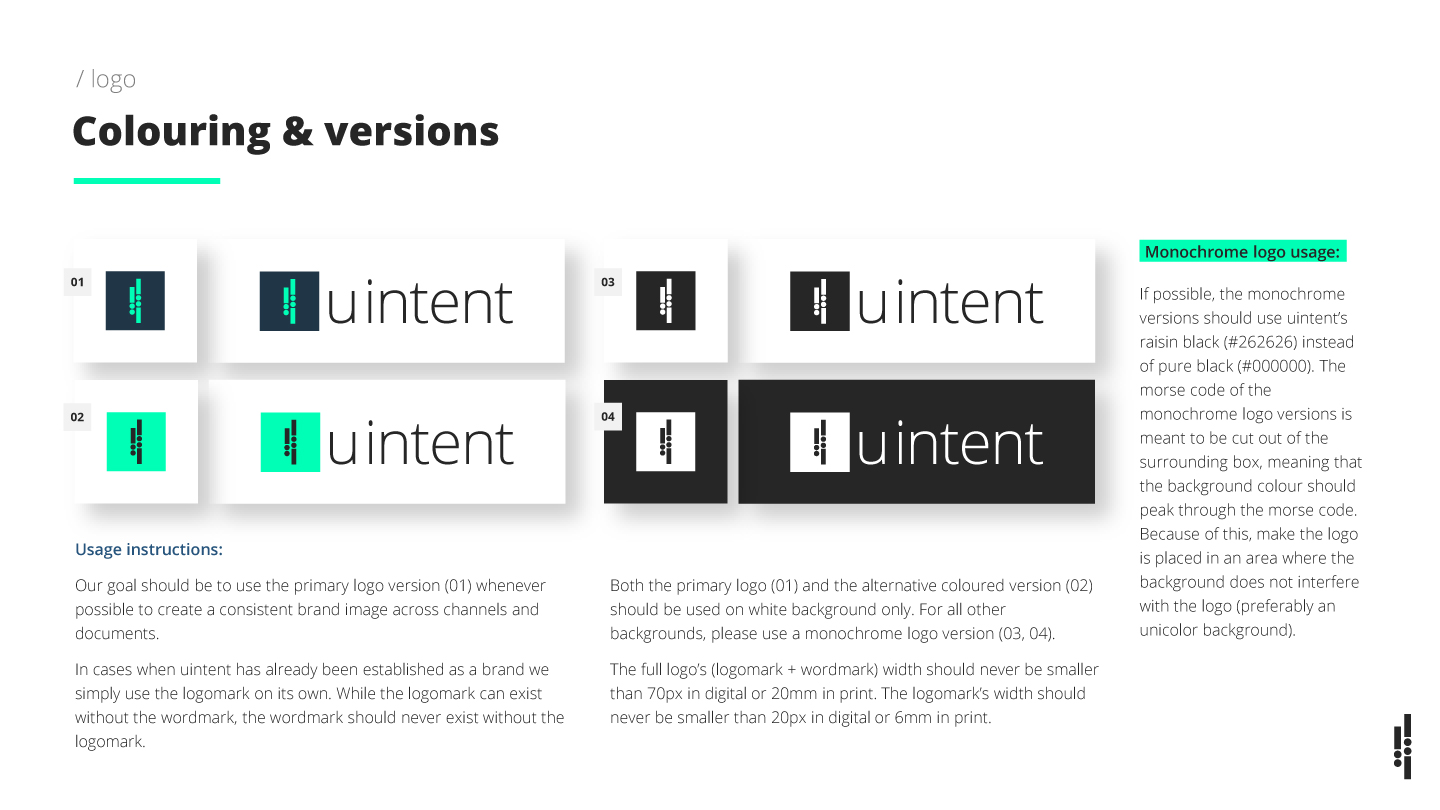
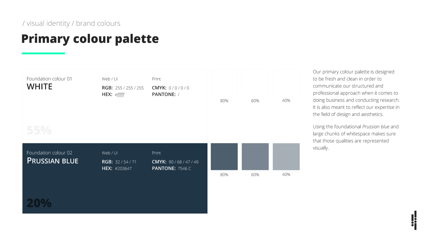
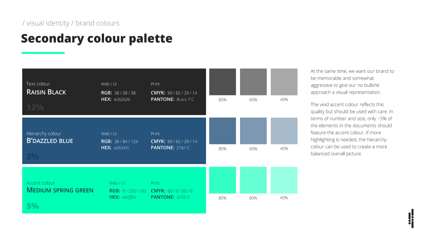
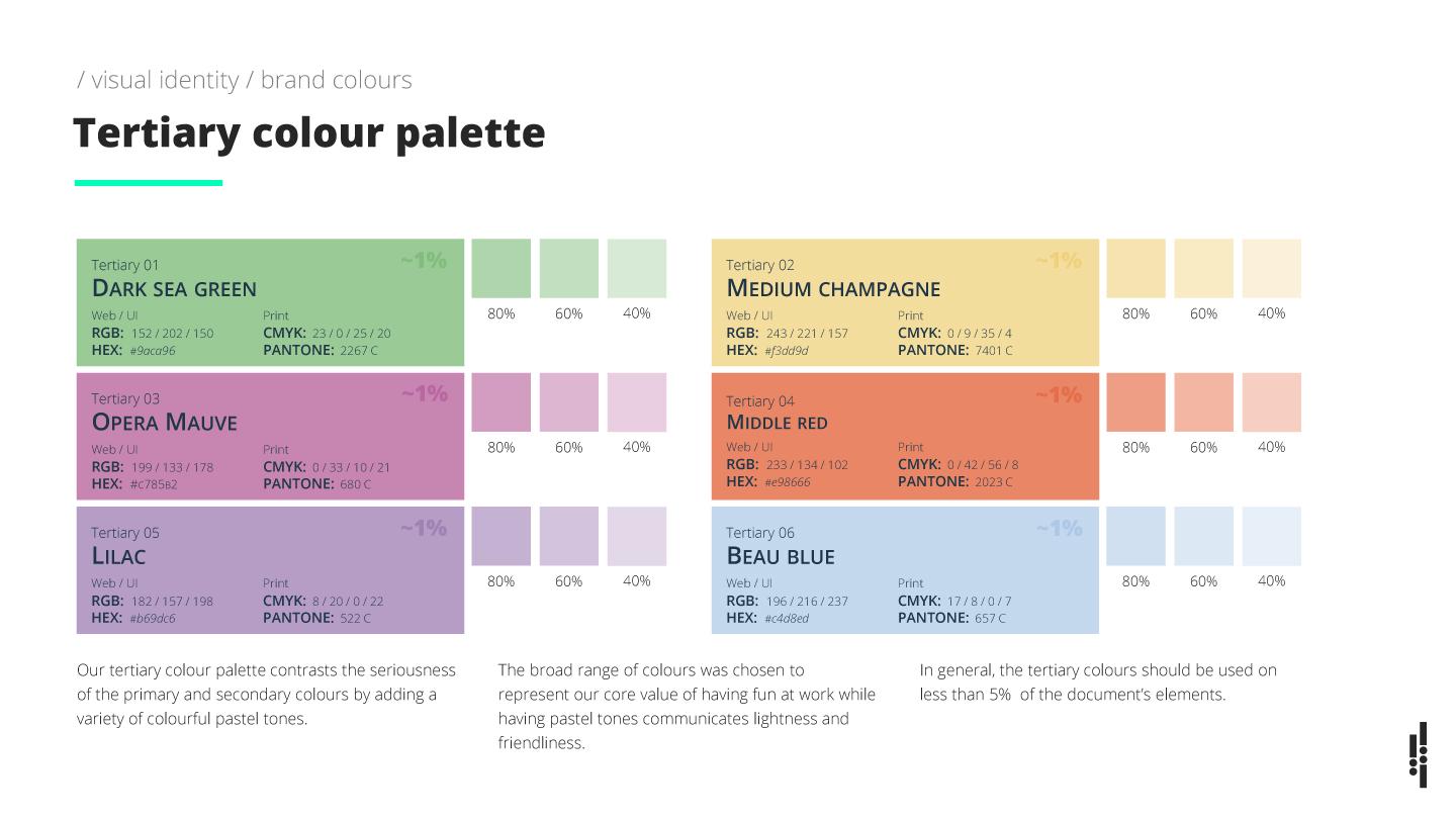
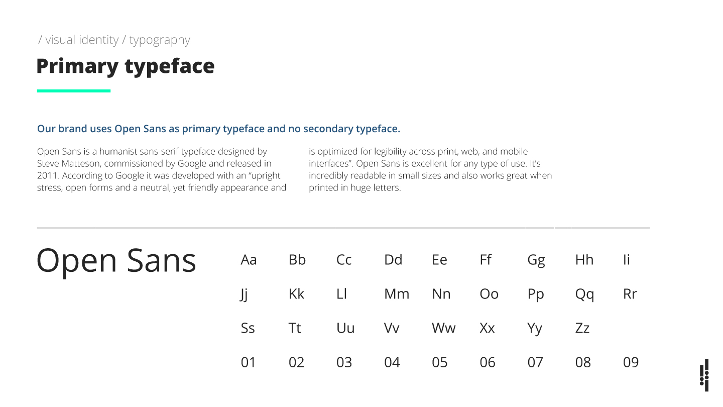
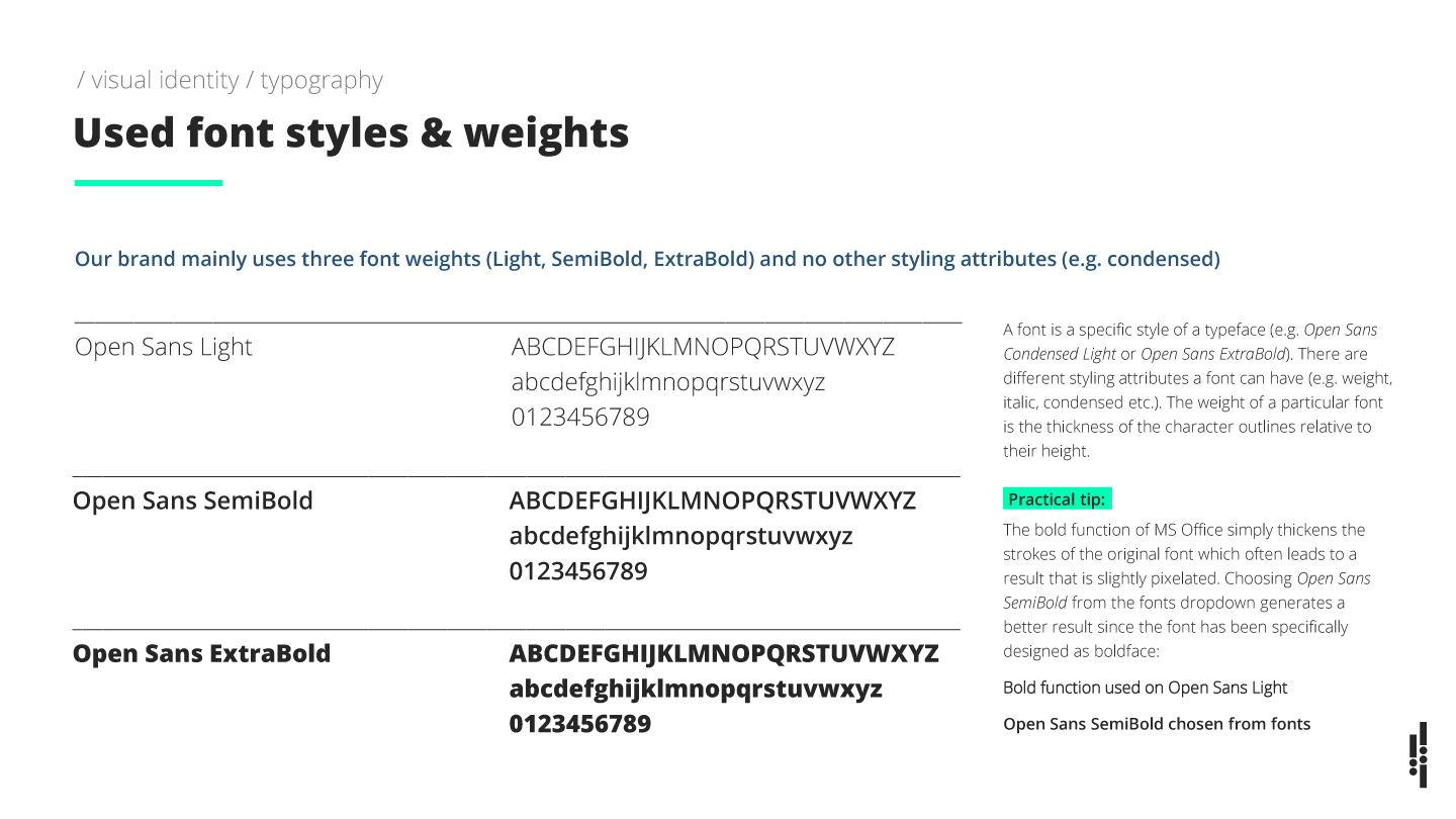
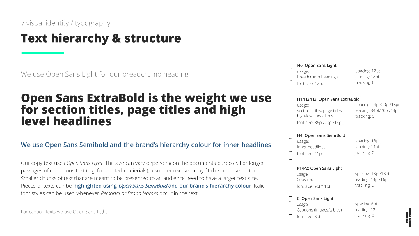
Brand development: uintent’s design guidelines
We did not go too far with defining rules on imagery since having those rules somehow contradicted our ideas of self-responsibility and employee freedom. Because of that, our brand guide actually did not materialize until much later in the process.
A few months later we had to realize that our corporate materials and communications sometimes did not look very coherent. Consequently, we had to adjust our approach and I created a corporate style guide.
UX & interaction design: uintent’s company website
The big chunk of work that was left was the creation of our corporate website. First, we set up a provisional site since our agency was already doing client business and we urgently needed one.
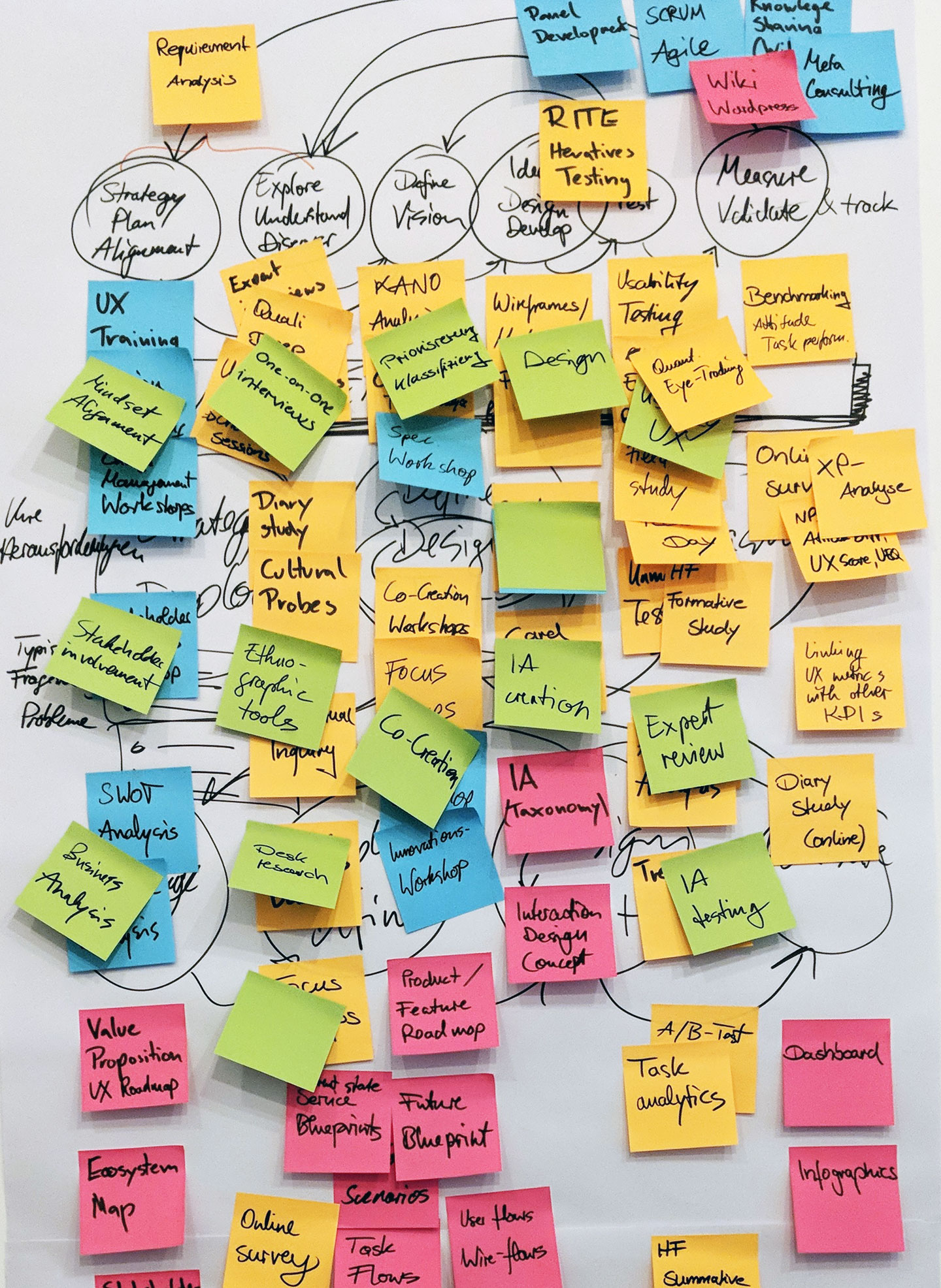
I then set up multiple design workshops in which the team developed first drafts of our website’s information architecture. We did a quick card sorting and ended up with three main categories. In another workshop, we structured our portfolio of UX services and created four service clusters (1. Explore / 2. Design & Iterate / 3. Measure / 4. Strategy).
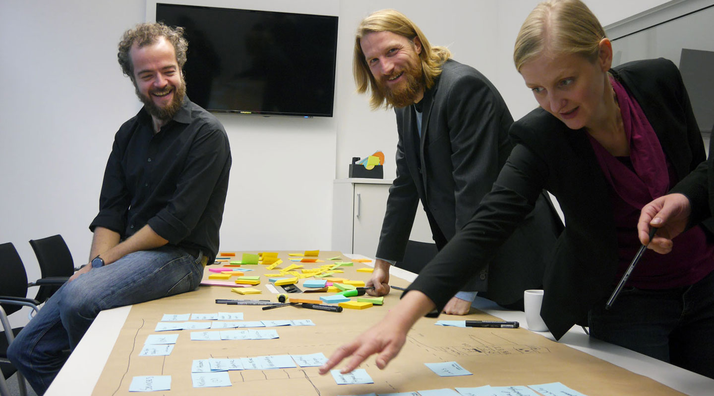
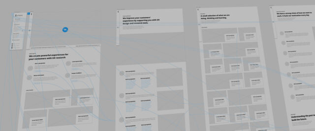
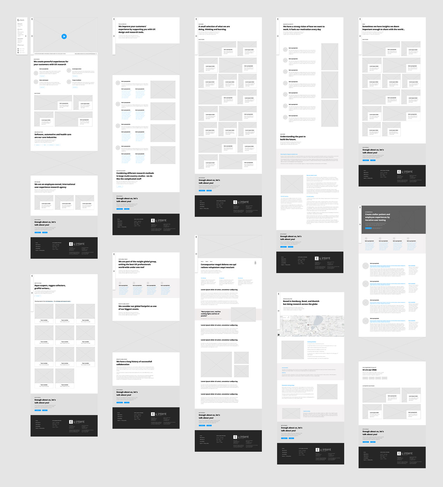
I took the input from all the design sprints and workshops and started creating conceptual designs, wireframes and interaction designs. Using Adobe XD, I created a partially interactive prototype that I regularly showed to my co-workers to get their thoughts.
Around that time, we also started involving some of our key clients and asked them about their preferences and pain points regarding agency websites. We also showed the prototype to some of them and gathered some quick feedback.
Results & deliverables
This way, I designed, iterated and re-adjusted until the team was happy with the draft and we felt comfortable with the overall page architecture. We then moved on to do the re-launch of our website. One of my co-workers took care of contents and copywriting, I and another co-worker were tasked with web development.
We used WordPress as CMS, Elementor as front-end toolkit and a gazillion lines of custom CSS and JS. After a few weeks of intense work we were able to re-launch our website and celebrate a major milestone in our brand development efforts.
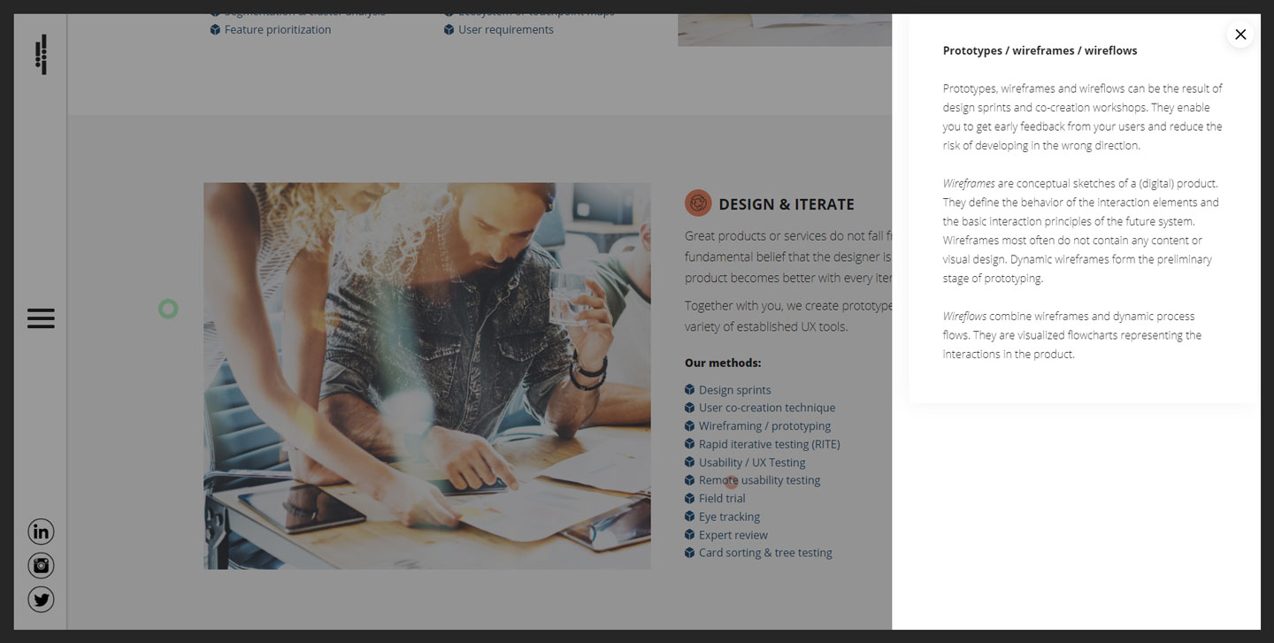
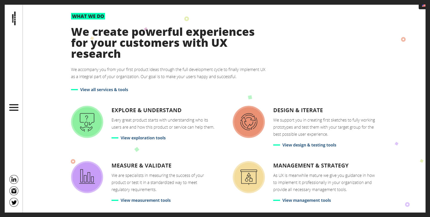
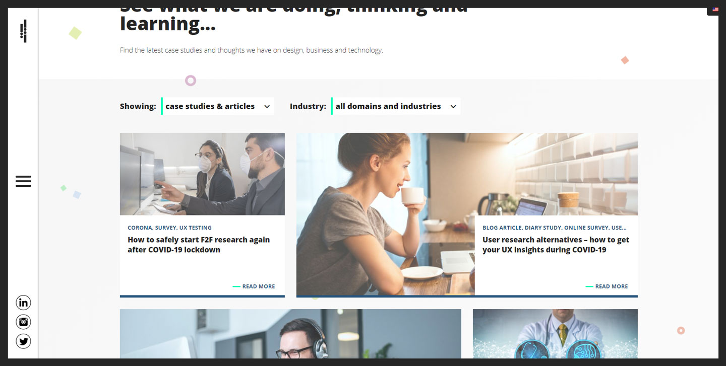

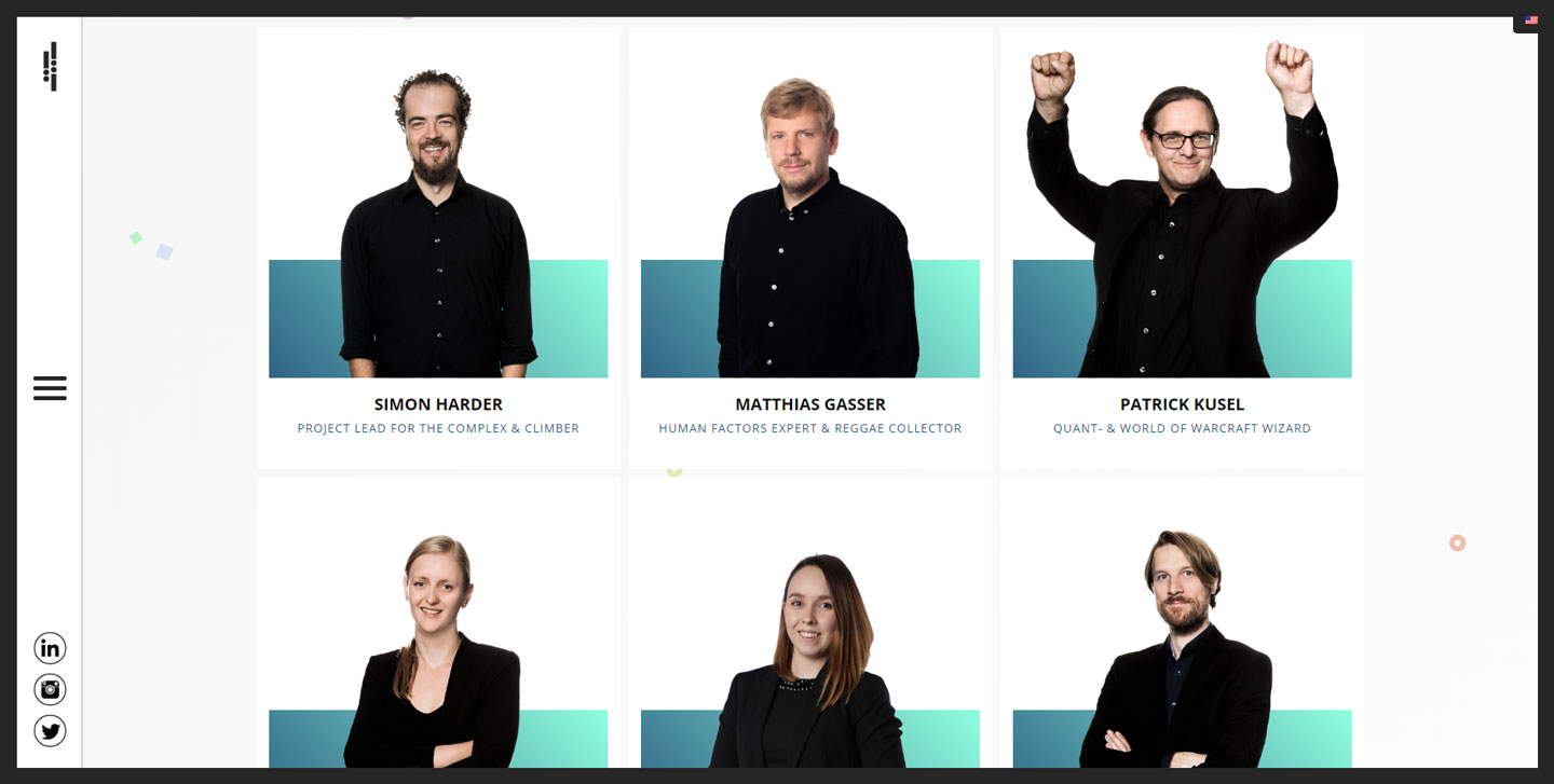
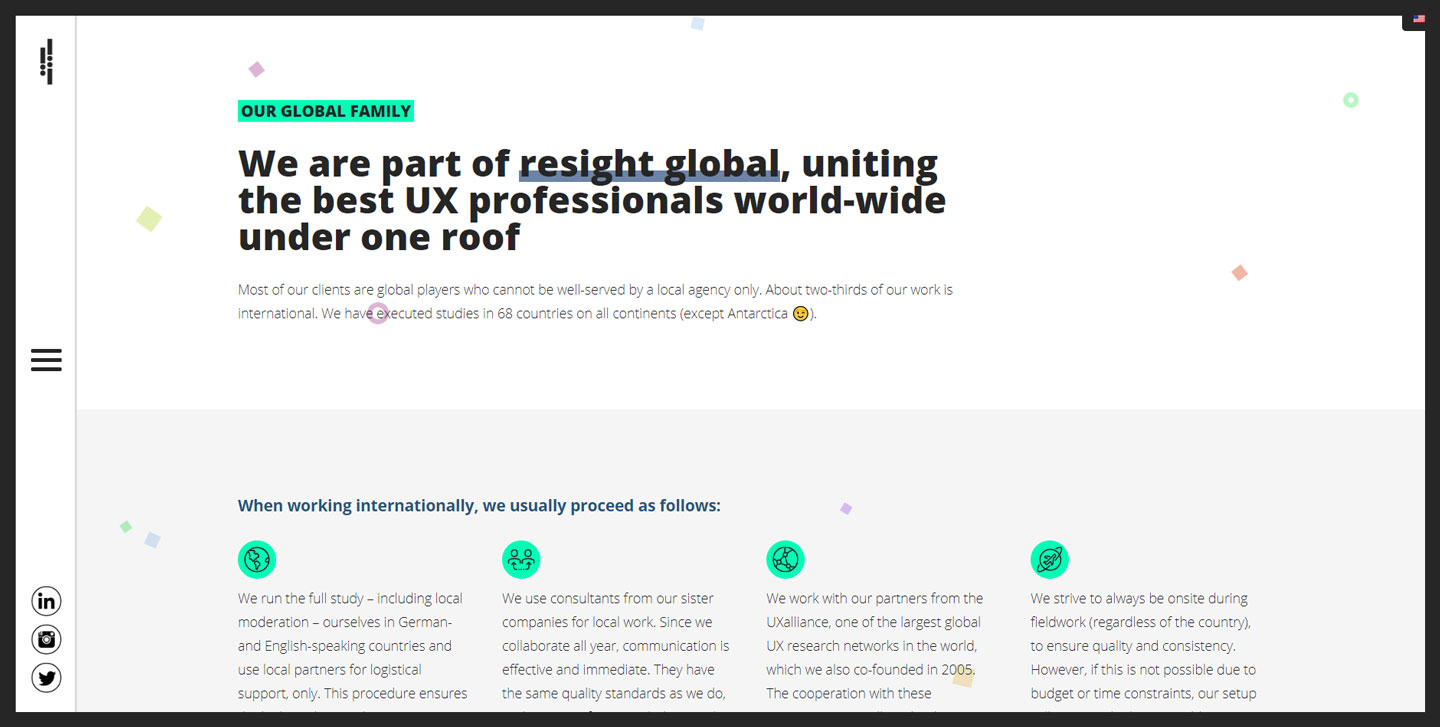
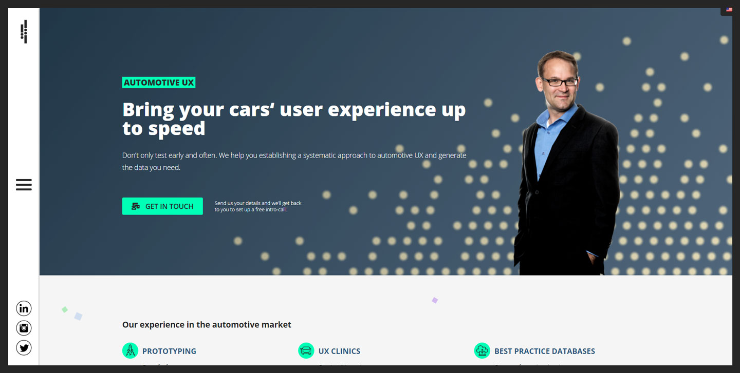
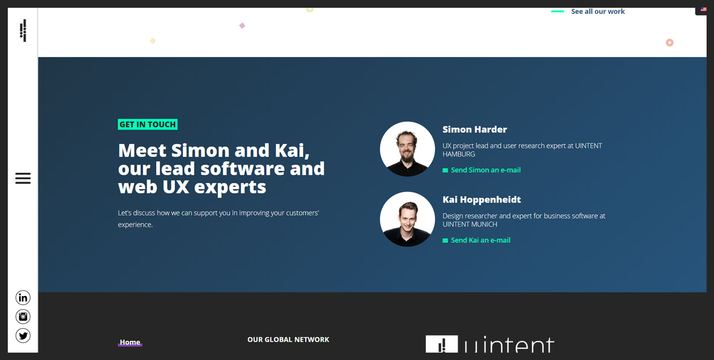
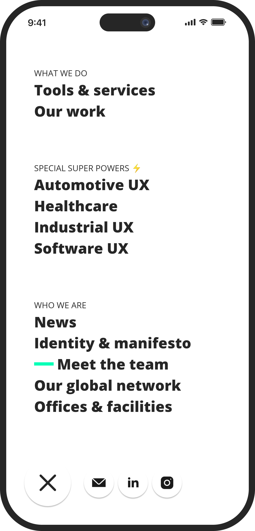
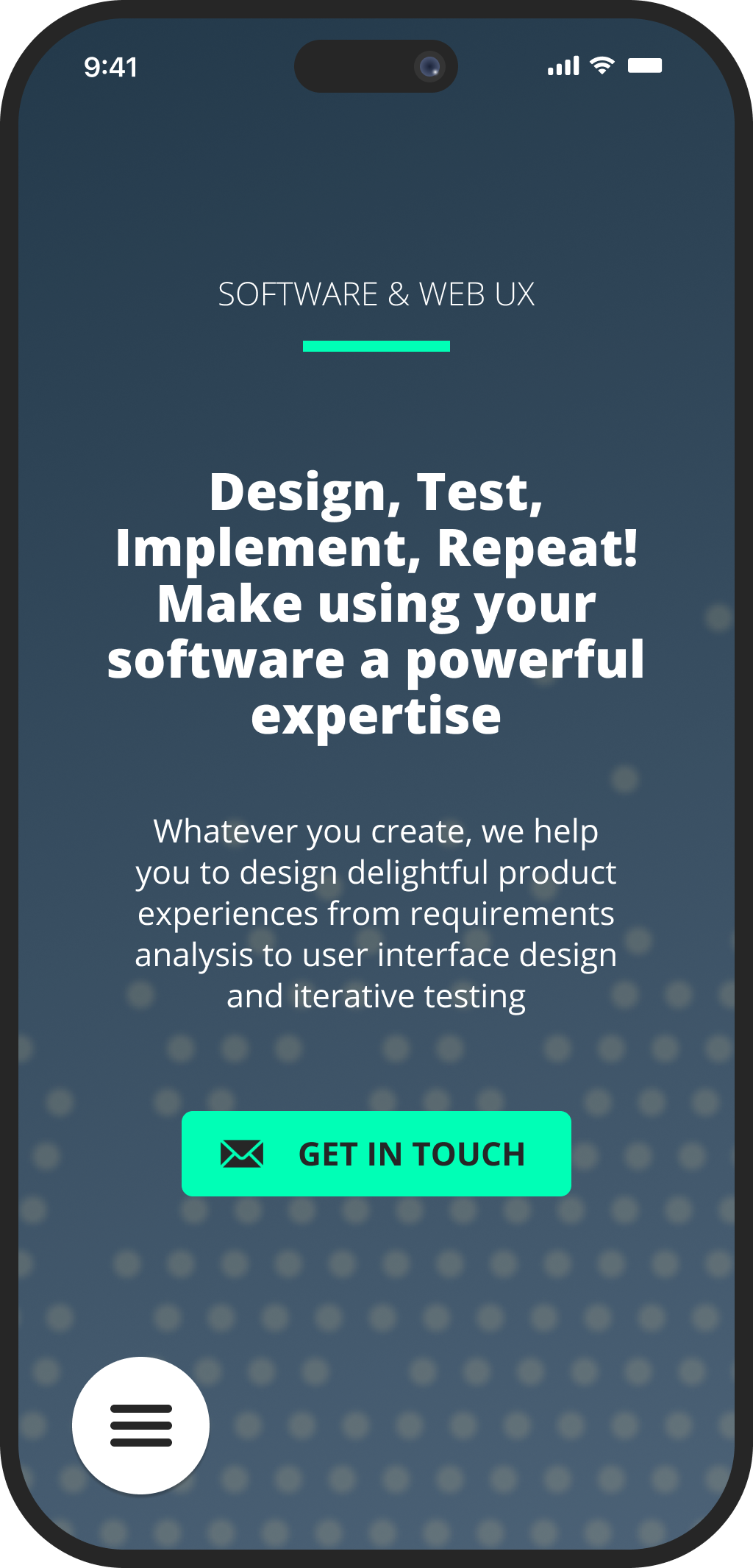
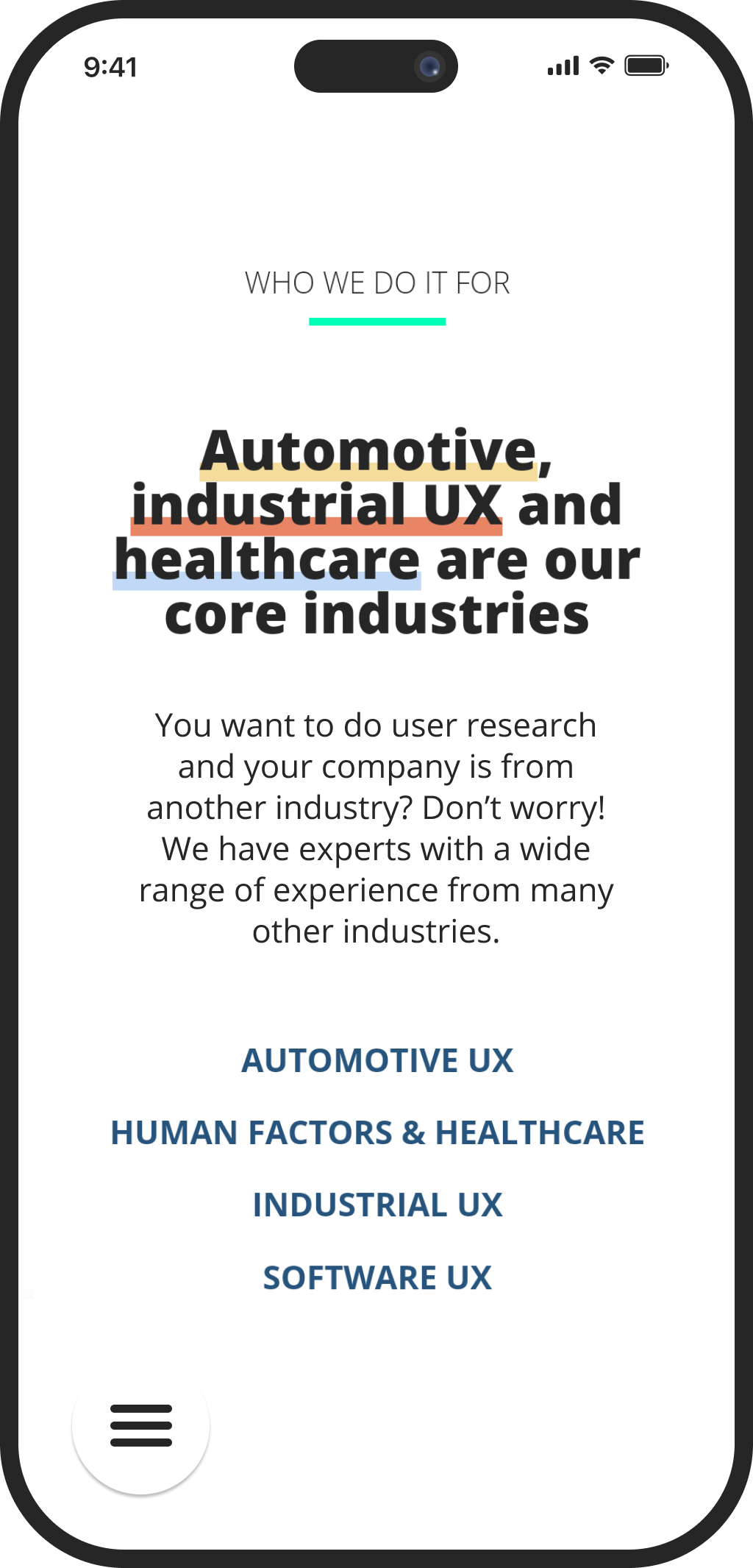
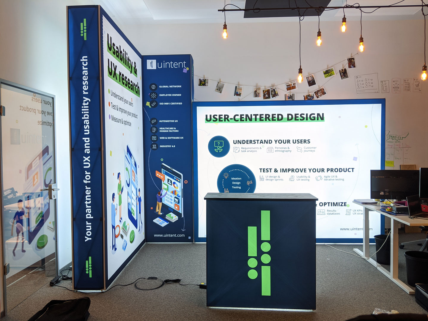
Along the way, I also found the time to create a brand guideline (see pictures above) and created some additional marketing materials like business cards, a lot of PowerPoint slides, a conference booth and tri-fold flyers.
Takeaways
Building a brand is a mammoth task and doing it while also working on client projects made it even harder. Of course the process wasn’t as linear as this case study might suggest. It was a zigzag course and retrospectively, I would have done a lot of things different.
What made the process so interesting is that we did not have a clear hierarchy at uintent and decisions were made by discussing and finding consensus. However, it turned out that finding consensus on design drafts is not as easy as with more rational topics. Having eleven people on our team, it was almost certain that there was at least one person for every draft who absolutely hated it (without being able to give reasons).
Along the way it became clear that I had to step forward and make the decisions when there was no consensus. Doing so wasn’t easy because of our special model of sharing responsibilities but looking back, I should have done it a little earlier.
I also learned to differentiate proper design critique and comments on personal taste a lot better. Everyone has a quick opinion on page layouts or colour schemes. However, when listening to the feedback from co-workers it is important to focus on well-founded and constructive design critique.
