Restructuring the information architecture of a large telecoms provider
Card sorting
Information architecture
Usability testing
Overview
Our client (a large telecommunications provider) was redesigning their website’s main navigation and wanted to evaluate the site’s information architecture to ensure its fit to the users’ mental model. We decided to combine qualitative 1-on-1 interviews with a computer-assisted open card sorting and a brief usability test.
My role
UX researcher
Tools & deliverables
Card sorting
Usability Testing
Information architecture
Written PPT report
Background & challenges
Our client (one of Germany’s large telecommunication providers) was in the process of redesigning their consumer website’s main navigation and wanted to improve the site’s information architecture. The project’s main goals were…
- …to gain a better understanding of the users‘ mental model – how they perceive and how they would group the primary categories.
- …to collect feedback on what information architecture fits the consumers‘ mental models best.
- …to determine what menu layout (mega dropdown, burger menu, sticky menu) is the most appealing to users and provides the best usability for both desktop and mobile.
On the client side, I was working with a team of UX professionals (UX team lead, UX designer, information architect) who didn’t need to be sold on the importance of user-centricity. As an expert for early user research from GfK, I was brought in to plan and conduct the study and generate the insights needed to achieve the goals.
To spice things up, the project was somewhat political. A few years back, the client had merged with another telecommunications provider and the main menu still reflected the silo-like structure of the company. The project team feared that restructuring the navigation could become a heated debate between the departments and people standing behind the main categories (more space in the main menu means you are more important I guess). We had to provide solid ground for these debates so that the users won’t come up short.
The process
In order to match all project requirements and stay within the client’s budget, we knew that we had to come up with a trade-off for the study design. Setting up a quantitative card sort and validating test materials beforehand while separately evaluating the design alternatives was not an option.
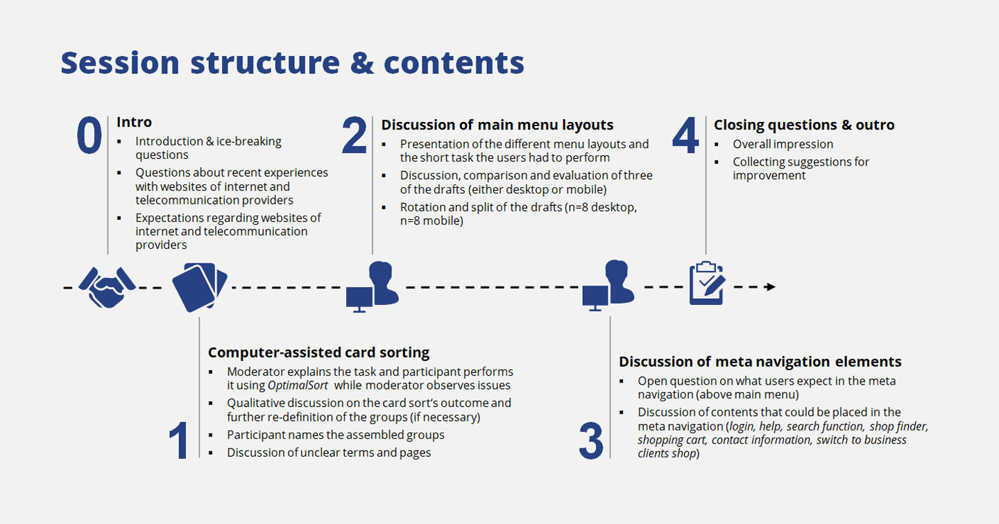
Combined evaluation of information architecture and usability
So we decided to combine qualitative 1-on-1 interviews with a computer-assisted card sorting and a brief usability test with only one scenario. This approach allowed us to…
- …cover the information architecture part as well as the design evaluation part.
- …explain the rather complicated content types to the participants (which we couldn’t do in a quantitative setup).
- …actually hear why the users would group certain topics and discover the underlying logic of their categories.
We kept sample size to N=16 with 90 min. sessions to stay in budget and tested in Munich and Cologne. The participants were split into five segments according to client criteria. We decided to do an open card sorting in which the users decided how many groups to build and how to name them.
Creating the cards
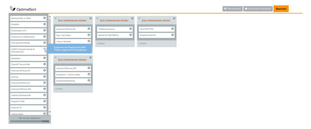
We started with the website’s existing information architecture and created 56 cards with brief descriptions (seems a lot but we had to cover four main categories, each with 5-6 hierarchy levels). This actually was one of the hardest parts of the project as we knew that all the decisions we made here (e.g. how to describe pages without suggesting a certain category or which ones to intentionally leave out) had strong impact on the results. To set it all up, I used OptimalSort, a pretty useful online card sorting tool.
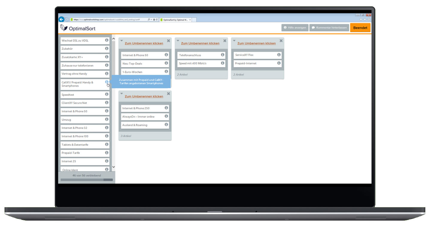
On top of that, the client’s UX designer prepared three menu layouts for both desktop and mobile. A rotation plan made sure all designs had the same chances of performing well. We spent the last 30 minutes of each interview discussing the pros and cons of each layout and observed the issues participants had when using them.
Results & deliverables
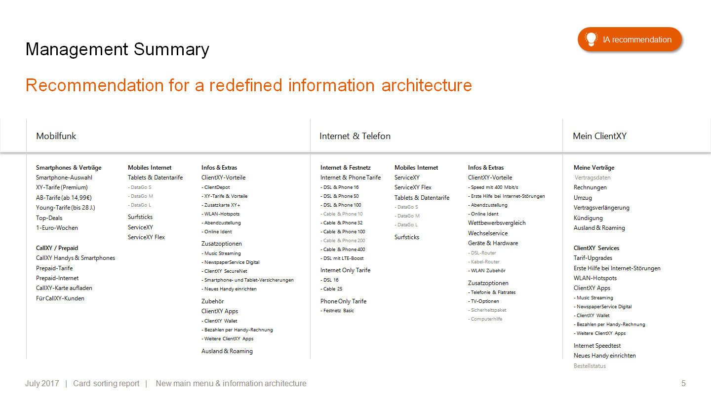
OptimalSort gave us the dendrograms and the similarity matrix. I combined these outputs with the qualitative data we collected during the interviews in order to translate the data into actual insights. With our qualitative approach, we made a deep dive into the users’ mental models and I was able to create a detailed PPT report that explains the reasoning behind the clusters formed by the participants.
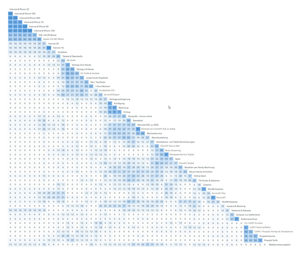
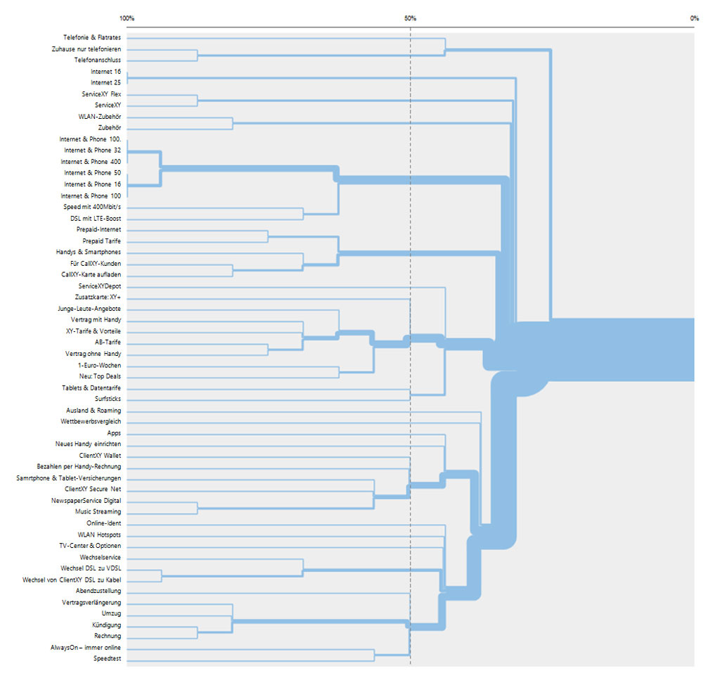
We ended up with 2-5 cluster solutions for the three main categories (mobile telephony, internet & phone, and the users’ area for personalized content). Those clusters helped the team to get a clear picture of the users’ perception and provided great guidance on how to construct the new information architecture (plus data to back it up if the internal debates got heated).
The results of the small usability test showed a clear favorite for desktop users (mega menu) but where inconclusive for mobile. However, for both mobile and desktop we were able to point out what parts of the interface worked well and which ones did not.
Takeaways
Although we had a detailed report with solid recommendations, we had to admit that one of the project’s issues became more noticeable during data analysis. We knew that the sample size would be too small to produce robust dendrograms and similarity matrixes. Looking at the diagrams, one had to realize that the data was a little thin for some categories. Luckily, we had a lot of qualitative data to throw in and figure out what clusters worked best and provided a consistent logic.
For me personally, the biggest takeaway was that as a UX researcher, I have to push the team a little more to limit questions and topics to a manageable work package.
Throwing in more and more topics (I had more side quests that I didn’t even mention above) watered down the project’s core. In my opinion a clear focus on the card sorting and the information architecture would have been more beneficial for the team.